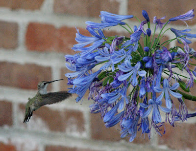
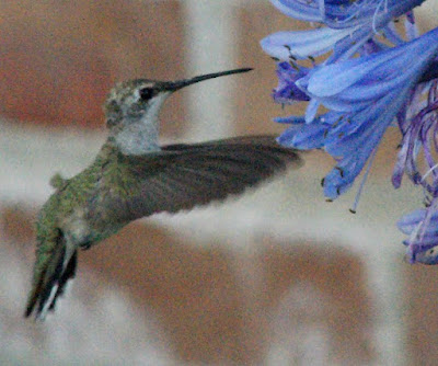
 The first thing I wanted to do was "focus" more closely on the hummer itself, so I cropped the image in from all sides. Because I was shooting at a very high ISO to try to capture the motion of this amazingly fast creature, the image is very grainy--though not apparent in the original, it is much more noticeable in the enlarged view. While I don't particularly mind the graininess, I do find the background quite distracting--the brick wall, especially the white/gray mortar between the bricks, pulls my eye away from the beauty of the hummingbird.
 To attempt to eliminate the bright distracting pattern behind the bird, I began to copy and paste small portions of the red brick throughout the photo, starting with large bits and gradually decreasing the size of the portion as I moved closer to the bird and the blossoms. This took a very long time--perhaps those with more Photoshop expertise than I could do it more quickly and more expertly, as I was not fully satisfied with my work, given the unnatural pattern that resulted:
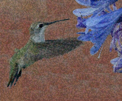
 To try to "smooth out" the background, I began to play with special effects/filters. The first is "dry brush"--but it didn't do to the background what I wanted:
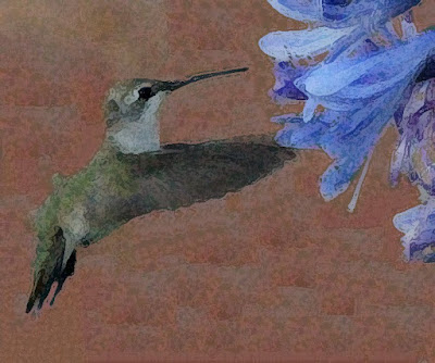 Next, I played with the "grain" filter--again, without the desired effect, though somewhat better than the first filter:
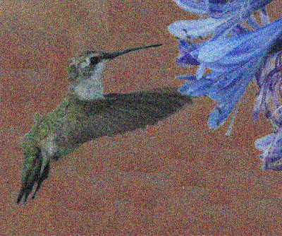
Moving on, I tried the "spatter" filter, but I wasn't happy with what it did to the hummingbird:
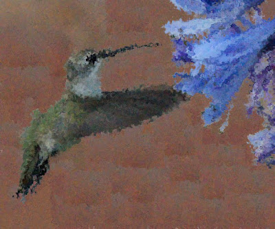 After that, I tried the "speckled" filter--and began to approach my vision for the background, but again, the subject ended up not to my liking:
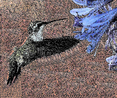 A very interesting and pleasing effect came from the "pointillize" filter--perhaps a little light, but overall, I like the way it glows:
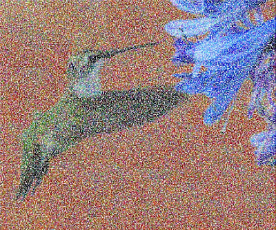 I continued to try other options. Here is the image through the "craquelure" filter--I like this one very much because it has a very substantial feel to it:
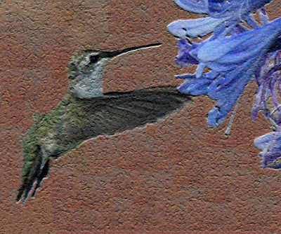 I also tried the "craquelure" effect in black and white--it has a certain appeal, and certainly a lot of texture:
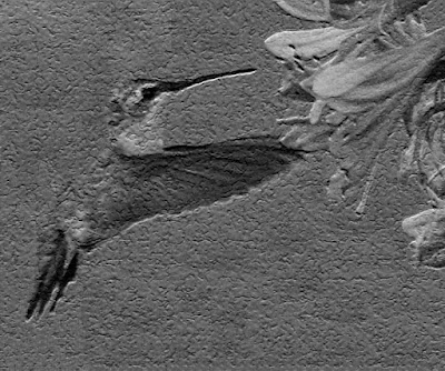 Finally, my favorite by a very small margin over the "craquelure" effect--the image as seen through the "sponge" filter:
Of course, there are many more filters (and infinite settings for each filter) that are available, so this is just a small sampling of what you might be able to do with some of your favorite images. Don't be afraid to play around! (But be sure to save your original image file in a safe place so that you can always go back to the beginning if you need to.)
